Messaging Insights Dashboards
Messaging Insights real-time dashboards enable you to:
- Visualize and analyze your application's messaging activities.
- Identify and debug issues.
- Optimize delivery.
- Find areas to boost engagement with your end-users.
This guide walks you through the basic functionality of the dashboards along with common usage examples. You can find the dashboards in the Twilio Console by navigating to Monitor > Insights > Messaging.
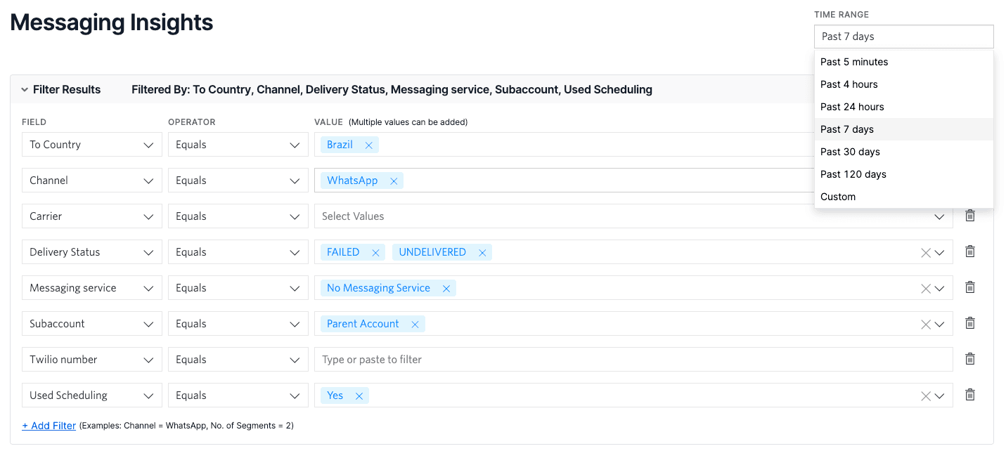
You can use filters to narrow down your data across different dimensions throughout all of the Messaging Insights dashboards. These filters include:
- Time range
- Channel
- Carrier
- Country
- Delivery Status
- Messaging Service
- Error Code
- Sub-account
- Twilio number
- Used Scheduling
Use these filters to narrow down the range of messages to the ones you care about for a given task.
The Overview dashboard helps you analyze delivery health in your messaging application with this view of incoming versus outgoing messages. Use case, carrier filtering, and geography all affect message deliverability, so we recommend regular monitoring this dashboard to establish a baseline.
Access the following new products on the Communications Insights Overview page:
- Intelligent Discovery AI Assistant: Provides Generative AI assistance with Twilio's messaging data using natural language.
- Deliverability Score: Provides a high-level overview of the performance of your Twilio messaging traffic.
- Intelligent Alerts: Monitors the health of your messaging traffic through analysis of changes in error code volumes.
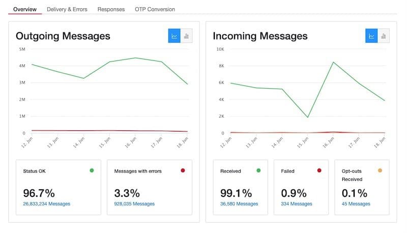
In this dashboard, the following tiles give you a high-level understanding of delivery rates:
Outgoing Messages
- Status OK: Counts messages with Delivery Status of "Delivered", "Delivery Unknown", and "Sent" as Status OK
- Messages with Errors: Counts messages of "Undelivered" or "Failed" as Messages with Errors
Incoming Messages
- Received: Incoming Messages that are successfully received and passed to your incoming webhook URL
- Failed: Incoming Messages that were not successfully received and passed to your incoming webhook URL
The Delivery & Errors dashboard provides three views to identify patterns in delivery status, error code, and message rates of undelivered or failed messages. Once you identify patterns that affect message deliverability, you can find the most prevalent error codes. To see what's happening at a granular level, look at individual messages and go straight to the related API Error or Warning documentation.
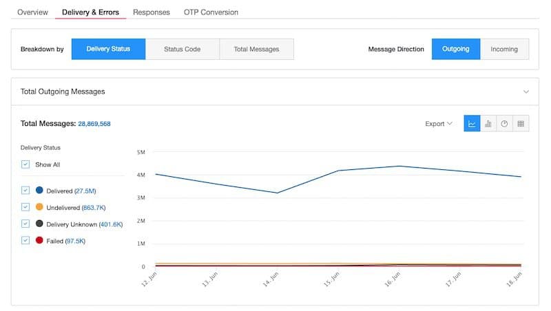
For example, you could visit the Delivery & Errors dashboard to identify the following patterns:
- A carrier incident causing a rise in undelivered messages
- A Twilio number being filtered
- Country-specific issues
- A misconfigured Messaging Service
The three views break down your deliverability data into different buckets, allowing you to find patterns in delivery status, error codes, and total messaging volume:
- Delivery Status tab: Monitor delivery status over time and identify issues by carriers, countries, subaccounts, Messaging Services, and phone numbers. Look for spikes to indicate changes.
- Status Code: Drill into error codes to quickly understand which ones are commonly appearing. You can click on the legend to go straight to the relevant documentation.
- Total Messages: See how many messages you sent, divided into different categories.
Selecting one of the three breakdown views changes the view of the data in the six charts below. Additionally, you can filter all of the charts by time range, carrier, and the to/from country.
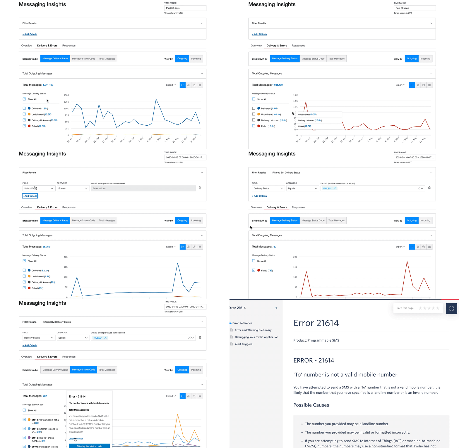
Say that you notice a rise in the number of failed outgoing messages. Let's use the Delivery & Errors dashboard to debug.
- Triage the spike by narrowing down to the time window that has the most instances of failed messages. Under the Delivery Status tab, select only the Failed delivery status.
- Drill down to find the most common error codes on the Status Code tab.
- Fix: Use the linked documentation to learn possible solutions, and view the list of messages to get a comprehensive view of the messages that are failing with that specific error code. For example, if you identified Error 21614 as the most common error code within the pool of failed messages, the linked documentation explains possible solutions for handling invalid
tophone numbers.
The Responses dashboard gives you a picture of how your end-users engage with your messages. Catch spikes in rates of opt-outs or "help" messages to find places where your users are disengaging or need more information.
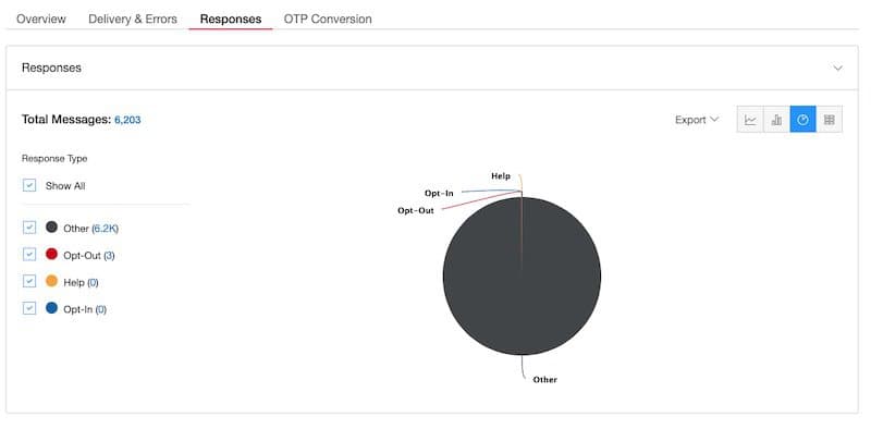
The Responses dashboard displays all of the different responses that you receive from your end-users:
- Other: Most Twilio users want to optimize for increased "other" responses. These are messages that contain actual responses from your end-users, signaling engagement.
- Opt-Out: These are responses from users who choose not to receive further messages from you. (See the documentation on Advanced Opt-Out.)
- Help: These are responses from users which match your defined "help" keywords.
- Opt-in: These are responses from end-users matching your defined "opt-in" keywords.
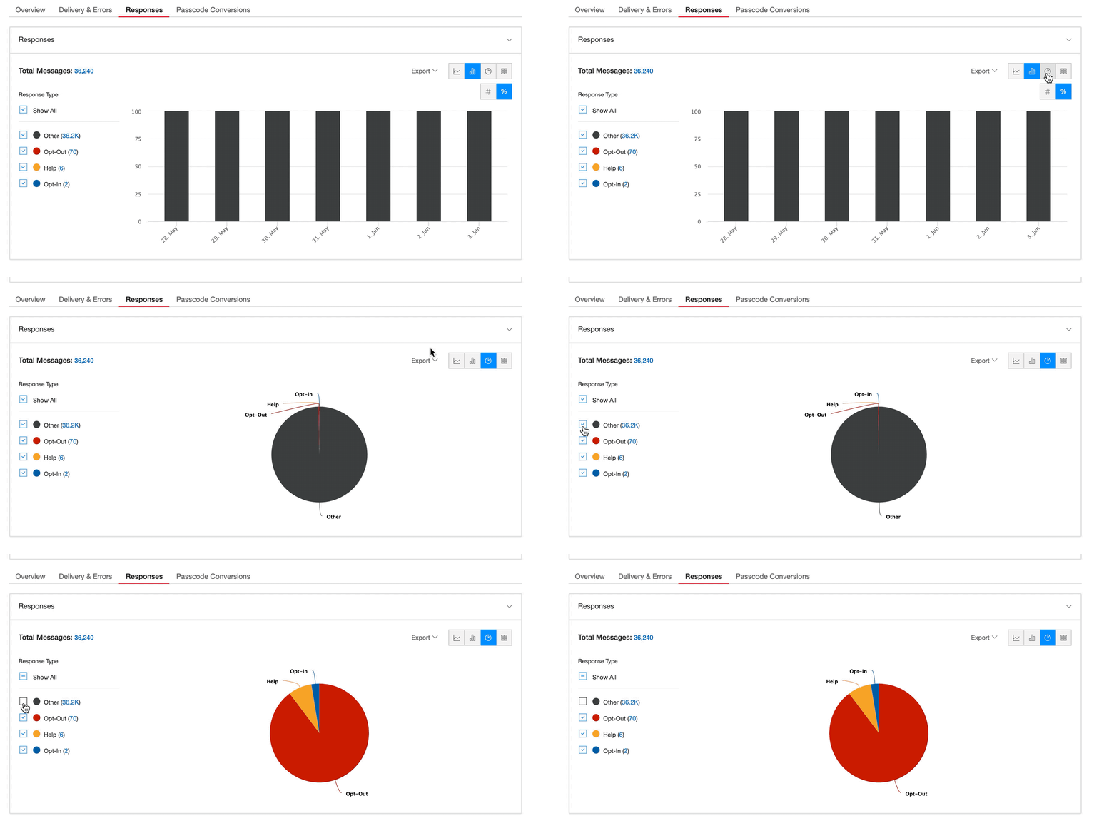
If you notice a sharp increase in the number of opt-out responses in the Responses dashboard of Messaging Insights, hover over the chart to see the trend for a given day. From there, you can view the message list for these opt-out responses and determine if the spike is related to the content of messages that you sent during that time frame.
The OTP Conversion dashboard helps you see the effect of your funnel when someone uses Two Factor Authentication (2FA) with the Feedback API.
Many Twilio customers send verification code messages using Twilio. Other terms for these messages include One-Time Passcode (OTP), 2FA, MFA, Verification Code, Pin Code, etc. with a 4-6 digit passcode that a user uses to authenticate.
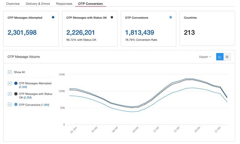
In the OTP Conversion dashboard, you can get a high-level view of your OTP delivery with the following tiles:
- OTP Messages Attempted: A message request to Twilio with the
provide_feedbackfield set to True - OTP Messages with Status OK: A message request to Twilio with the
provide_feedbackfield set to true that has a delivery status of "OK" - OTP Conversion: A "Confirmed" outcome that has been provided for a Message is considered a conversion event.
You can add the provideFeedback parameter on an API request to create a message. When your end-user correctly inputs the OTP and authenticates, you send message feedback to Twilio. Your messages are delivered more consistently if you use the Feedback resource to send Twilio a confirmation when you know one of your end-users has successfully received your message.
This feedback on message delivery provides more accurate and complete information than what is often provided by carriers. Twilio uses AI-based routing systems to monitor the conversion signal that we receive and improve our messaging traffic. If our systems detect a drop in OTP conversion rates, for example, Twilio quickly changes the routing accordingly.
Info
You must be using Twilio's Feedback API to activate the OTP Conversion dashboard.
We recommend using the provideFeedback parameter on only OTP messages to ensure a clean set of OTP-related data in the OTP Conversion dashboard.
Let's say that you have used the provideFeedback parameter and submitted feedback information via the Feedback Resource. In the OTP Conversion dashboard, Twilio aggregates all of the data streams to show you:
- how many OTP messages you have attempted sending via Twilio ("OTP Messages Sent")
- how many messages had no delivery issues ("OTP Messages with Status OK")
- how many messages converted ("OTP Conversions")
- the number of countries in which you are sending OTP messages
First, calculate the cost of total messages attempted ("OTP Messages Sent"). Dividing this number by the number of total successful conversions ("OTP Messages with Status OK") yields the average cost per conversion. Knowing this metric indicates whether your systems are using user authentication in a cost-effective way.
Additionally, you can visualize your per-country data in the OTP Message Volume chart. Clicking on any of the countries listed filters down to that specific country so that you can track delivery and conversion on a per-country basis.
The Scheduled dashboard shows metrics related to the volume of messages that are scheduled to be sent using Message Scheduling. You can use it to view the amount of upcoming scheduled messages by day or hour so you can make informed decisions about your future throughput.
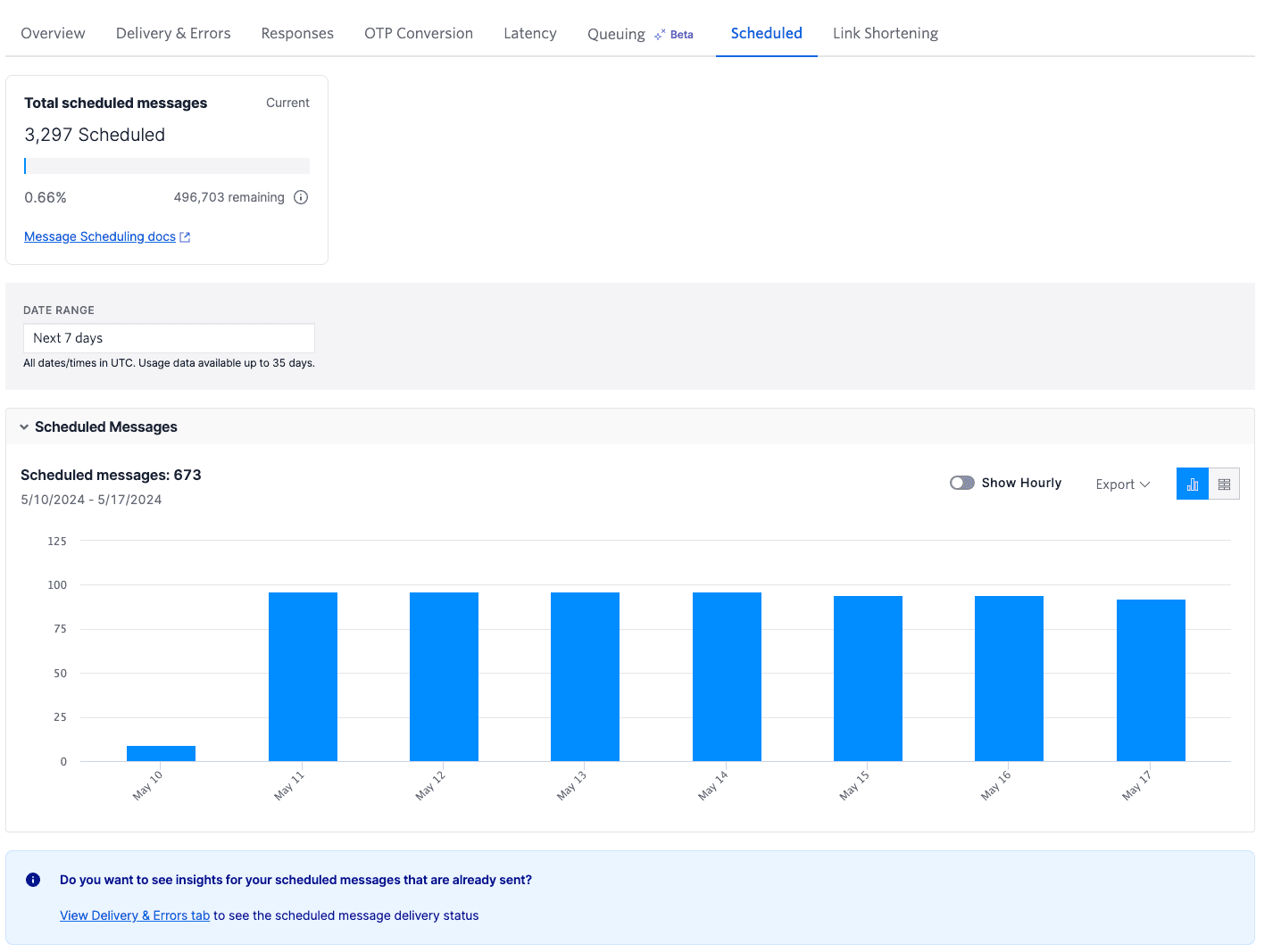
The Total scheduled messages tile shows you how many messages are currently scheduled and the amount of schedulable messages remaining on your account.
The Scheduled Messages graph visually displays the volume and distribution of scheduled messages over the selected date and duration ranges.
The Link Shortening dashboard shows success metrics for messages sent using Link Shortening, a feature that shortens long links within message bodies. You can use the information provided such as deliverability and click-through rates to assess the effectiveness of messages sent using shortened links.
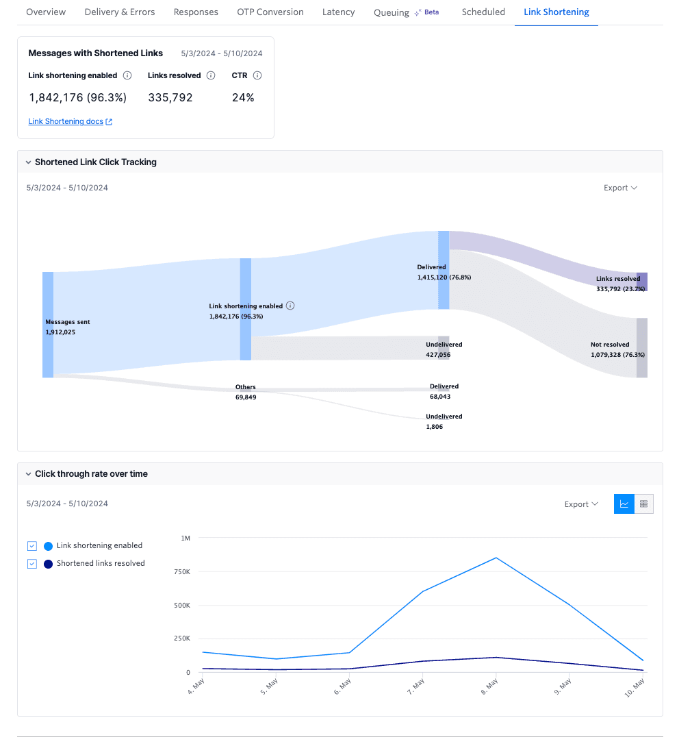
The Messages with Shortened Links tile shows you how many messages you sent with Link Shortening enabled, how many links were resolved (clicked), and the overall click-through rate (CTR) percentage.
The Shortened Link Click Tracking graph displays the lifecycle view of messages sent with and without Link Shortening so you can compare their deliverability rates.
The Click-through rate over time graph shows the number of messages delivered with Link Shortening and how many of those links were clicked.
Visit Messaging Insights in the Console to explore the different dashboards and learn more about the factors influencing your message delivery rates.