Add Components to Flex UI
In this guide, we'll add a custom component to the TaskInfoPanel that features a to-do list for the Agent. This component will appear at the bottom of the info panel, and will render some HTML.
In order to complete this activity, you'll need a local Flex Plugin development environment setup (start here).
Start your local development environment by running twilio flex:plugins:start inside your Flex Plugin's directory. An instance of Flex should now be open and initialized in your browser at localhost.
Since we'll be modifying the content within the Task Information Panel (TaskInfoPanel), let's start by creating a Task to view our ongoing development. Each Flex installation is setup with a phone number to develop with. To create a test task, do the following:
- Find your Flex provisioned phone number in the phone numbers page of the Twilio Console.
- Text or call the phone number.
- Open your Flex instance and accept the new task.
- In the Task Panel, open the Task's Info tab.
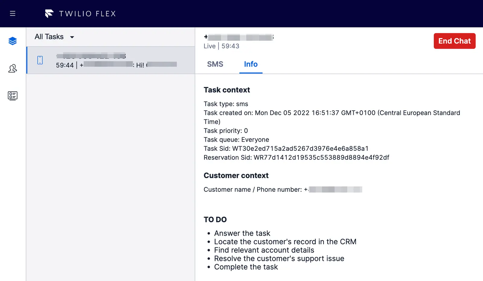
This is where we'll be working to add the Todo List.
The default Flex TaskInfoPanel is populated with information about the Task, such as type, priority, and customer context.
We're going to add a little bit of additional information for our Agent in the form of a brief to-do list. For now, this will just be static HTML, and it will be the same for every Task.
Let's start with the HTML we'd like to render in the info panel. We'll include a line break and a horizontal rule for visual consistency with the existing info panel components, and then add a heading and a brief unordered list filled with items for our Agent.
1<div>2<br />3<hr />4<p>TO DO</p>5<ul style={{ listStyle: "disc", paddingLeft: "20px" }}>6<li>Answer the task</li>7<li>Locate the customer's record in the CRM</li>8<li>Find relevant account details</li>9<li>Resolve the customer's support issue</li>10<li>Complete the task</li>11</ul>12</div>
Organization of your components is up to you. For this example, we're going to create this component in a new file in src called MyCustomTaskInfoPanelItem.js. Open this file in your editor and add the following component code:
1import React from 'react';23const MyCustomTaskInfoPanelItem = () => (4<div>5<br />6<hr />7<p>TO DO</p>8<ul style={{ listStyle: "disc", paddingLeft: "20px" }}>9<li>Answer the task</li>10<li>Locate the customer's record in the CRM</li>11<li>Find relevant account details</li>12<li>Resolve the customer's support issue</li>13<li>Complete the task</li>14</ul>15</div>16);1718export default MyCustomTaskInfoPanelItem;
This wraps the HTML from above in a function component named MyCustomTaskInfoPanelItem. If you're new to React components, see the React components and props documentation.
Now that we have a component, it's time to bring it into the canvas. First, we need to import the component. Open your main plugin file (example: TodoPlugin.js) and add the following line:
import MyCustomTaskInfoPanelItem from "./MyCustomTaskInfoPanelItem";
Next, let's use the add() method to add our component to the canvas. The area of the canvas we're concerned with is the TaskInfoPanel. Add the following line to your app's init() method:
flex.TaskInfoPanel.Content.add(<MyCustomTaskInfoPanelItem key="to-do-list"/>);
Here, we're following the schema of Component.Content.add/replace(<MyComponent />, {options}), where Flex.TaskInfoPanel is the base component and we are using the add() method to insert our new MyCustomTaskInfoPanelItem component, with a key of "to-do-list" and no additional configuration options.
If you're starting with the default plugin and have not changed anything else yet, your TodoPlugin.js will look like this:
1import { FlexPlugin } from 'flex-plugin';2import React from 'react';3import { MyCustomTaskInfoPanelItem } from './MyCustomTaskInfoPanelItem';45const PLUGIN_NAME = 'TodoPlugin';67export default class TodoPlugin extends FlexPlugin {8constructor() {9super(PLUGIN_NAME);10}1112/**13* This code is run when your plugin is being started14* Use this to modify any UI components or attach to the actions framework15*16* @param flex { typeof import('@twilio/flex-ui') }17* @param manager { import('@twilio/flex-ui').Manager }18*/19init(flex, manager) {20flex.TaskInfoPanel.Content.add(<MyCustomTaskInfoPanelItem key="to-do-list"/>);21}22}
Save the file, and switch to your instance of Flex UI. To see the to-do list, click on the Info tab.
After you've added your first component to Flex UI, you can extend it in several ways:
- Make this component more dynamic with props (the Task object is a good place to start). To explore component props, go to the Flex UI API Reference.
- Reconfigure the canvas by using the replace() method to swap in your custom components.
- Try creating a custom component that uses a third-party API.