Flex UI 1.x.x components
This page applies to Flex UI 1.x.x.
For the Flex UI 2.x.x version of this content, see Flex UI Components.
Info
Auto-Generated Documentation for the Flex UI is accurate and comprehensive, and so may differ from what you see in the official Flex UI documentation.
Flex UI is a library of programmable or dynamic components that expose a Content property and allow you to add, replace, or remove any component and its children.
Every programmable Flex UI component exposes a Content property. You can override these components programmatically using the add, replace, and remove methods with options.
Warning
You must declare a key for all components.
1Flex.Component.Content.add(<MyComponent key="demo-component"/>, {options});2Flex.Component.Content.replace(<MyComponent key="demo-component"/>, {options});
Example
The following example adds a component called AnotherMuteButton to the MainHeader component. The AnotherMuteButton component appears aligned to the end (left, in the example) and placed as the first component in front of native components MuteButton and UserControls:
1Flex.MainHeader.Content.add(<AnotherMuteButton key="mute"/>, {2sortOrder: -1,3align: "end"4});
The remove method allows you to remove immediate children of a programmable component by their key.
Flex.Component.Content.remove(key, {options});
Example
The following example shows removing the AnotherMuteButton component from the MainHeader component mute key set in the previous example.
Flex.MainHeader.Content.remove("mute");
Used in both add and replace methods to add conditions on which component is added or replaced.
Example
1Flex.MainHeader.Content.add(<AnotherMuteButton key="mute"/>, {2if : props => props.task.source.taskChannelUniqueName === "custom1"3});
Used in the add method to specify the order in which the new component is placed in relation to other children of the parent component. Native children components take priority. Sort order counter starts with 0. To always place a new component at the start or end of the order, use large numbers like -100 or 100, depending on the direction.
Example
1Flex.MainHeader.Content.add(<AnotherMuteButton key="mute"/>, {2sortOrder: -13});
Used in the add method to align new components either to the top/bottom or right/left, depending on the direction of the parent component. Possible values are:
- start: aligns new component on the left or top
- end: aligns new component on the right or bottom
Example
1Flex.MainHeader.Content.add(<AnotherMuteButton key="mute"/>, {2align: "end"3});
Each immediate child of a component has a key (required for the add and replace methods) and a set of properties that its children inherit. To find a component's key or explore component props, go to the Flex UI API Reference.
View Full Component Reference >
Direction: Horizontal
View Full Component Reference >
Direction: Horizontal
View Full Component Reference >
Direction: Horizontal
View Full Component Reference >
Direction: Horizontal
Direction: Horizontal
To customize the NotificationsBar, see the Notifications Framework.
View Full Component Reference >
Direction: Vertical
View Full Component Reference >
Direction: Horizontal
View Full Component Reference >
Direction: Vertical
View Full Component Reference >
Direction: Vertical
View Full Component Reference >
Direction: Vertical
View Full Component Reference >
Direction: Vertical
View Full Component Reference >
Direction: Vertical
View Full Component Reference >
Direction: Vertical
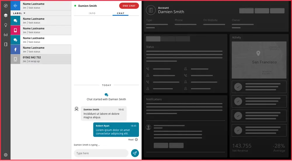
For details on how to configure filters for the task list, see Flex UI configuration.
View Full Component Reference >
Direction: Vertical
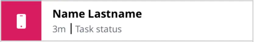
Add, replace, remove, and properties of the TaskListItem are described in the Task Channel Definition API.
Direction: Horizontal
Add, replace, remove, and properties of the TaskListItem are described in the Task Channel Definition API.

Examples
Adding a button to Chat type task
1Flex.DefaultTaskChannels.Chat.addedComponents = [{2target: "TaskListButtons",3component: <Flex.IconButton key="eye_button" icon="Eye" />4}];
Adding a button to Chat type task when it is in accepted state
1Flex.DefaultTaskChannels.Chat.addedComponents = [{2target: "TaskListButtons",3component: <Flex.IconButton key="eye_button" icon="Eye" />,4options: { if: props.task.status === "accepted" }5}];6
Removing a reject button from Chat type task
1Flex.DefaultTaskChannels.Chat.removedComponents = [{2target: "TaskListButtons",3key: "reject"4}];
View Full Component Reference >
Direction: Vertical
View Full Component Reference >
Direction: Horizontal
View Full Component Reference >
Direction: Horizontal
Example
Add tabs and content
1import { Tab } from "@twilio/flex-ui"23init(flex, manager) {4const Img = <img src="http://someimage.jpg" />;56flex.TaskCanvasTabs.Content.add(7<Tab icon={Img} iconActive={Img} key="my-new-tab">8<MyNewTabComponent/>9</Tab>10);11}
View Full Component Reference >
Direction: Vertical
View Full Component Reference >
Direction: Vertical
View Full Component Reference >
Direction: Horizontal
View Full Component Reference >
Direction: Vertical
View Full Component Reference >
Direction: Horizontal
View Full Component Reference >
Direction: Vertical
View Full Component Reference >
Direction: Horizontal
View Full Component Reference >
Direction: Vertical

View Full Component Reference >
Direction: Vertical

View Full Component Reference >
Direction: Vertical
View Full Component Reference >
Direction: Vertical

View Full Component Reference >
Direction: Horizontal
View Full Component Reference >
Direction: Vertical
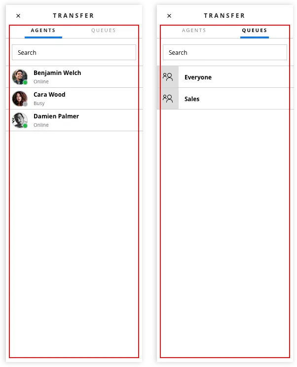
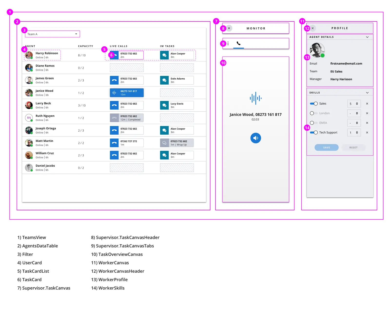
The Worker directory contains 2 tabs by default:
- Agents - key
workers - Queues- key
queues
Example: Add new custom tab
1Flex.WorkerDirectory.Tabs.Content.add(2<Flex.Tab key="my-tab" label="My Tab">3<div> "Hello World"4</div>5</Flex.Tab>6);
Worker Directory Tabs Hidden Filters
WorkerDirectoryTabs accepts 2 default props:
hiddenWorkerFilterhiddenQueueFilter
Flex applies filters to the list in combination with the filter the user applies by typing in a search string. You can programmatically apply a filter that's hidden from the user, which means the user can't disable it. You could use this feature to pre-filter the list of available transferees an agent can search and choose from to show their team members or available agents only. The following example uses live query to do the following:
- Filter the agents list to only show agents with a specific
team_nameattribute (you can set user attributes via your SSO provider) - Filter the agents list to only show agents that are in the
Availableactivity - Filter the queues list to only show queues with a specific
queue_nameattribute
1// Filter Agents by Worker Attributes or activity_name2Flex.WorkerDirectoryTabs.defaultProps.hiddenWorkerFilter = 'data.attributes.team_name CONTAINS "sales"'3Flex.WorkerDirectoryTabs.defaultProps.hiddenWorkerFilter = 'data.activity_name CONTAINS "Available"'45// Filter Queues by queue_name or queue_sid6Flex.WorkerDirectoryTabs.defaultProps.hiddenQueueFilter = 'data.queue_name CONTAINS "sales"'
The hidden filter feature is only available in @twilio/flex-ui@1.26.0 and later. Starting in 1.33.3, the hiddenWorkerFilter has been changed to queueFilter which takes a predicate function.
Flex.WorkerDirectoryTabs.defaultProps.queueFilter = (queue) => queue.queueName.includes("HR")
View Full Component Reference >
Direction: Horizontal
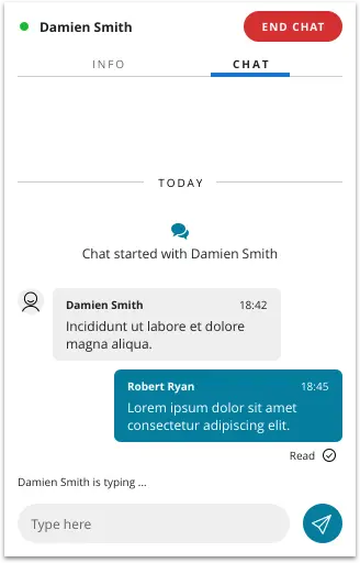
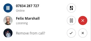
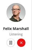
ParticipantsCanvas is a responsive component and will switch between regular mode and list mode depending on the size of the container its placed in. Regular mode and list mode contain different children - ParticipantCanvas and ParticipantCanvasListItem respectively. When customizing ParticipantsCanvas children, like adding an additional button, remember to do customization to both children components
Regular mode
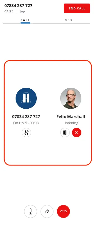
List mode
View Full Component Reference >
Direction: Horizontal
Direction: Vertical
WorkersDataTable is a programmable component. It is a Material UI table styled to the Flex theme with data from the Insights SDK.
View Full Component Reference >
Warning
As of flex-ui v1.12.0 new exports were added to refer to workers instead of agents:
- WorkersDataTable
- WorkerListFilterSelect
- WorkersDataTable
- WorkersDataTableProps
- WorkerListFilter
For example, AgentsDataTable is now referred to as WorkersDataTable. However, previous exports (like AgentsDataTable) are kept for backwards compatibility
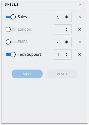
By default, WorkersDataTable contains the following rows:
-
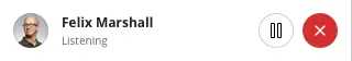
Agent - UserCard component
SupervisorUserCardFirstLine- default value retrieves the full name of the worker if it exists, and the identity if not. Variables provided to the template: workerSupervisorUserCardSecondLine- default value shows the availability of the worker. Variables provided to the template: worker- The first and second row are template strings with names.
-
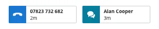
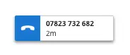
Calls -TaskCardList component, showing tasks of the voice channel in assigned and wrapping state
-
Other tasks - TaskCardList component, showing tasks of all channels (apart from voice) in assigned and wrapping state
You can add columns to the table programmatically. Columns can't be removed. You can add columns with different types of content:
TaskCardListcomponent- Any custom component
- String
TaskCardList
1import { TaskCardList, ColumnDefinition } from "@twilio/flex-ui";23Flex.WorkersDataTable.Content.add(4<ColumnDefinition key="calls" header={"My Custom Header"} content={(items, context) => <TaskCardList tasks={items.tasks} />} />);
TaskCardList also has an optional filter property. If you don't set the filter property, Flex renders all tasks in the list:
1export interface TaskCardListProps {2compareFunction?: (a: TaskData, b: TaskData) => number;3filter?: (task: TaskData) => boolean;4tasks: TaskData[];5}
Any custom component
1import { ColumnDefinition } from "@twilio/flex-ui";23Flex.WorkersDataTable.Content.add(<ColumnDefinition key="hello" header={"Helloxxx"} content={<div>hello</div>}/>);
String
You can use Worker attributes as follows:
1import { ColumnDefinition } from "@twilio/flex-ui";23Flex.WorkersDataTable.Content.add(<ColumnDefinition key="team" header={"Team"} content={item => item.worker.attributes.team_name}/>);
By default, WorkersDataTable has 2 filters:
- All agents
- Active agents - worker with current activity state set of type
available
Filters for the Workers Table can be programmatically changed, by defining filters property of WorkersDataTable component
Example of creating a filter to show workers with activity "Break"
With configuration object
1componentProps: {2WorkersDataTable: {3filters: [4{5query: 'data.activity_name == "Break"',6text: "Workers on break"7}8]9}10},...
With defaultProps API
1Flex.WorkersDataTable.defaultProps.filters = [2{3query: 'data.activity_name == "Break"',4text: "Workers on break"5},...6]
Query data schema
data object in the query refers to TaskRouter worker resource. The following attributes on a worker can be used for filters query:
| Object name | Description | Format |
|---|---|---|
| data.activity_name | worker's current activity friendly name | String |
| data.attributes | worker's attributes | Key value pair |
| data.date_activity_changed | date of the last activity change of the current worker | Datetime ISO8601 |
| data.friendly_name | worker's friendly name | String |
| data.worker_activity_sid | worker's current activity sid | String |
| data.worker_sid | worker's sid | String |
| data.workspace_sid | worker's workspace sid | String |
Query operators
WorkersDataTable is powered by Twilio Sync and Flex uses Twilio Sync Live Query for filtering of the workers. See Live Query docs for supported query operators.
View Full Component Reference >
Direction: Vertical
View Full Component Reference >
Direction: Horizontal
Direction: Horizontal

View Full Component Reference >
Direction: Vertical
View Full Component Reference >
Direction: Vertical

View Full Component Reference >
Direction: Horizontal

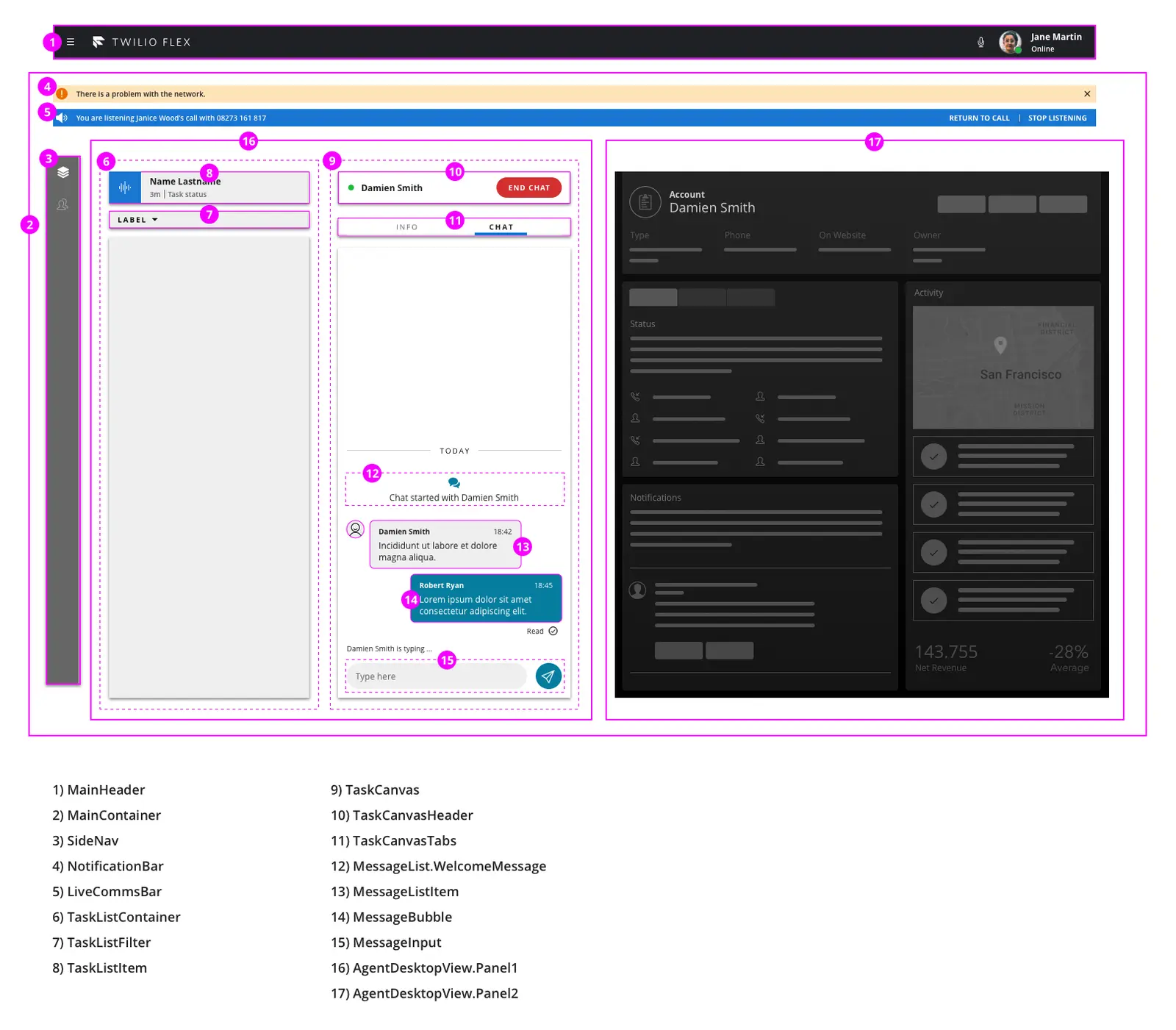
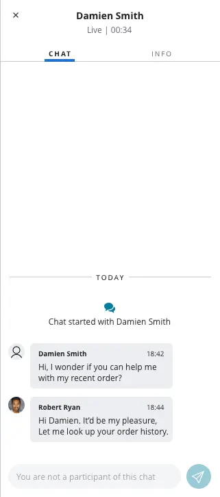
The Supervisor task canvas contains 2 tabs by default:
-
Overview - key
overview. Overview Tab has dynamic content based on the type of task- For standard conference based voice tasks - ParticipantsCanvas
- For messaging tasks - MessagingCanvas
-
Info - key
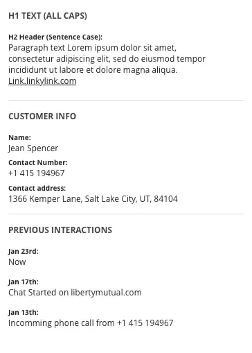
info. Info tab Contains SupervisorTaskInfoPanel
Examples
Adding tabs and content
1Flex.Supervisor.TaskCanvasTabs.Content.add(2<Flex.Tab key="my-tab" label="My Tab">3<div> "Hello World"4</div>5</Flex.Tab>6);
View Full Component Reference >
Direction: Horizontal
View Full Component Reference >
Direction: Vertical
View Full Component Reference >
Direction: Vertical
View Full Component Reference >
Direction: Vertical
View Full Component Reference >
Direction: Vertical